
Imagine someone opening a clinic's booking page on a phone. An appointment chart looks useful, but its labels are embedded in an image. The controls appear to work when tapped, yet a keyboard user cannot choose a date. After submission a small line changes, but it is unclear whether the clinic received a request or confirmed a booking. These are distinct barriers. Changing the page colors or adding an accessibility policy would not solve them.
POUR helps a team turn such observations into individual checks. This lesson gives practical examples, not a conformance audit, legal advice, or an assessment of a real clinic. The records and figures are fictional. The useful outcome is a reproducible observation, a named owner and a retest, not a general claim that the page is accessible.
Start with POUR as a baseline
POUR stands for Perceivable, Operable, Understandable and Robust. Perceivable asks whether the person can obtain the information. Operable asks whether they can carry out the task. Understandable asks whether the information and behavior make sense. Robust asks whether user agents, including assistive technology, can reliably interpret the interface. These are related perspectives, not four isolated systems. A button can be visible and keyboard reachable while still lacking a meaningful accessible name.
The approved Arabic *Digital Customer Experience* course explanation, physical PDF page 17 (slide 15/30), provides the conceptual introduction. The technical conditions below follow the W3C WCAG 2.2 Recommendation. The course slide illustrates Understandable with image alternative text; in the normative text, success criterion 1.1.1 belongs to Perceivable. Clear alternatives can aid comprehension too. An implementation refinement is important: informative, decorative and functional images have different purposes. A descriptive sentence is not automatically the right alternative for every image. The principles help find a question; the specific success criteria determine the requirements.
Perceivable: make the information available beyond the pixels
Success Criterion 1.1.1, Non-text Content, Level A concerns equivalent text alternatives for non-text content, subject to the criterion's stated exceptions. When an image contributes information, describe the meaning in context. An image showing how booking works may need a short identifying alternative and an adjacent explanation of the steps. A decorative photograph that supplies no information can have an empty alternative on a standard HTML image so the technology can ignore it. Avoid asking the reader to listen to a description of every visual border or texture.
For an image that functions as a control, communicate the action rather than its appearance. A magnifying glass that opens search should convey that purpose. If visible text already names the action on the same control, do not force the image to repeat it. For complex charts, identify the figure briefly in alternative text and put important numbers, units, relationships and caveats into visible prose or an accessible adjacent table. A filename does not convey meaning, and a long unstructured list in the alternative is not a good substitute for a useful representation. Review the image, the immediate context and the text together.
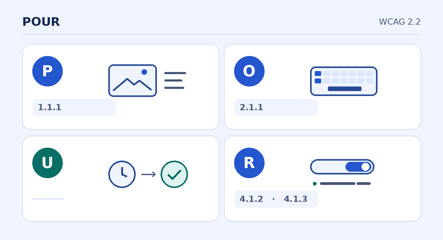
Original teaching map linking examples to the POUR principles. Pending and confirmed illustrate Understandable, not a single success criterion.
Operable: test the actual task with a keyboard
Success Criterion 2.1.1, Keyboard, Level A requires functionality to be operable through a keyboard interface without individual keystrokes having to meet specific timing. Its exception is narrow: the underlying function must depend on the path of movement, not merely the endpoints. Freehand drawing can raise that distinction. A booking date does not become a path-dependent task merely because a widget was implemented for pointer input. Try the meaningful action, not just whether you can tab into its container.
Test visibility and escape separately. 2.4.7, Focus Visible, Level AA asks whether keyboard focus can be seen while operating the interface. 2.1.2, No Keyboard Trap, Level A concerns leaving a component by keyboard; where more than standard movement keys are required, people must be advised how to leave. In a booking flow, try opening the date picker, selecting a date, changing it, revisiting an earlier field and leaving the widget. Entering it does not prove you can use or exit it. Write down the exact keystroke and state at which a problem appears.
Understandable: say what happened and what comes next
“Request received; no appointment is confirmed yet” can be a useful message when the system sent a request to a queue. It is different from a confirmation, which should be sent only when the slot has actually been confirmed and through the approved channel. This is an example of understandable communication, not a claim that an ambiguous use of “Success” automatically violates a standalone WCAG criterion.
Review the whole path for conflicting language. If submission does not book a slot, a button labeled “Send request” is more precise than “Book now.” Explain what information is needed and what should happen after submission. If someone can correct a field or use a telephone alternative, explain the option without blaming the person. Ask a reviewer who did not build the form to say whether a booking exists, whether the reader needs to act and who takes responsibility next. That check is more revealing than asking whether the page sounds friendly.
Robust: expose states and announce updates
Success Criterion 4.1.2, Name, Role, Value, Level A concerns what software can determine about interface components, including their names and roles and the states or values a person can set. Use native labeled controls where they support the interaction. For a custom slot selector, verify that assistive technology can identify the control, distinguish the options, determine which is selected and receive the change. Seeing the words on screen does not prove that the name and selection are exposed programmatically.
4.1.3, Status Messages, Level AA applies to status messages in markup-based content. When a message conveys a result, waiting state or progress without a change of context, expose it so assistive technology can present it without receiving focus. In the fictional booking form, announce the receipt through a suitable status mechanism and let focus stay in place. Do not send focus to every new line. A genuine navigation or dialog may require its own different focus behavior. Test the announcement with assistive technology rather than treating the presence of a code attribute as evidence it was conveyed.
Walk through a fictional mobile booking request
Start from an ordinary screen, then repeat at larger text sizes. Check that a reader can find opening times, instructions and the next action without relying on the image. Follow the form without a pointer and repeat with a supported screen reader. Open the date picker, choose a slot, correct it and leave the control. Submit synthetic data and check that the receipt is visible and announced without shifting focus. Repeat with incomplete information and with failed submission. Neither should return the same message as a successful request.
Do not test using real patient records. A generic booking form should not invite a medical history or other sensitive details unnecessary for the task. Keep a supported alternative for questions outside the form and a telephone option where the service supports it. Give each handoff an owner: from reading the instructions to choosing a time, from entry to submission, and from receipt to the next verified status. A team that can name each step can distinguish a frontend problem from a gap in operational responsibility. Keep actual clinical decisions and booking operations out of the exercise.
Reuse the MarketCulture figures with the denominator visible
The MarketCulture lesson compares two fictional groups of 200 eligible first-appointment requests. The baseline has 84 attended first appointments, or 42%. The test group has 96, or 48%. The observed difference is 6 percentage points. The denominator is eligible requests, not confirmed requests. These fictional values do not establish causation or clinical impact.
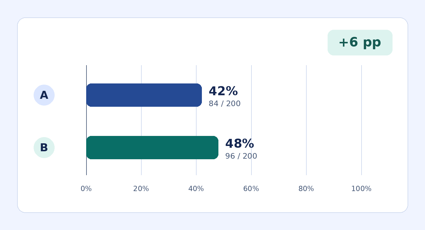
Original graphic using fictional figures. The gap is six percentage points, not a causal or clinical result. The same data follow in a table.
| Version | Eligible first-appointment requests | Attended first appointments | Attendance per eligible request |
|---|---|---|---|
| A | 200 | 84 | 42% |
| B | 200 | 96 | 48% |
A reader who cannot see the bars should still be able to recover the group names, numerators, denominators and meaning of their difference from the accompanying prose or a structured table. Do not rely on color alone to distinguish groups. Making the chart accessible does not make the underlying comparison causal. State that limitation next to the figures, including in the accessible explanation if needed to preserve the meaning.
Turn the walkthrough into a test matrix
Use repeatable rows containing task, setup, expected behavior, actual observation, owner and retest date. The chart row expects the group names, values and denominator to be available without looking at the bars. The calendar row expects the user to open it, select a date, change the choice and leave it without a pointer and with visible focus. The selector row checks the accessible name, role and relevant selection state. The submission row checks the distinct receipt, failure and progress states that are actually in scope, and whether a dynamic status is announced without moving focus. The privacy row requires synthetic records and checks that test exports contain no personal details.
Record the devices, browser and assistive technology used, and distinguish “passed here” from “not checked.” An automated scanner can identify some missing labels or alternatives, but cannot reliably assess whether a chart explanation is equivalent or a person understands that the clinic did not confirm their appointment. Keyboard testing alone cannot establish screen-reader behavior. Include different language versions where applicable and record devices, actions or content that remain untested. Passing these selected checks is not full WCAG conformance for a site or process.
A useful issue report isolates the condition that failed. For instance, report that the slot has a visible label but the accessible name is missing before selection, rather than stating that the whole widget is inaccessible. Preserve the exact setup and note whether the problem reproduces after refresh or after changing the selection. That gives the person who owns the fix enough information to test it without guessing. In the retest, preserve the original case and add the neighboring cases the fix might affect: selecting another slot, clearing the choice, leaving the widget and submitting a request that the server rejects. Assign a new status to each check rather than closing them all at once. Fix the underlying interaction before treating a workaround as the answer; a fallback can preserve a route to help, but does not by itself repair the barrier in the main flow.
Run the same test with a slow or interrupted connection in an isolated environment. At the point when the request is on its way, the interface can truthfully say it is sending. It should not call the request received before the service verifies that result. If a timeout leaves the outcome uncertain, don't turn uncertainty into a false rejection: provide a way to check or recover without assuming the person needs to send another request. Verify independently what appears visually and what the selected assistive technology announces. The combination explains whether the team knows that the service state and the interface state agree.
Use a synthetic record to decide how the team will spot accidental retries. If two presses appear on screen, record what the service actually received and whether the same request was counted twice; do not make a site-wide claim from a single retry test. A small operations team can use four columns: step, expected result, observed result and next action. For example, select a slot using a keyboard; the expected result is reaching it and changing its value. If the focus appears but the value never changes, retest keyboard operation separately from focus. Record the evidence in enough detail for a colleague to run the same test.
To close a release, name a decision owner, list the combinations that passed, note what was not tested and say what would halt the release. A blocker that prevents completing the task should not disappear inside an average of passed checks. Keep the slow connection, changed slot and localization cases in the regression set. None requires opening a real patient record or touching a real appointment.
Two exercises and answer keys
Exercise one: your team posts a chart with the alternative “Booking chart.” Draft a short alternative plus accompanying prose or a table. Answer: identify it as a comparison of attended first appointments by cohort. Then state baseline 84 of 200 eligible requests (42%), test 96 of 200 (48%), and the observed difference of 6 percentage points. Label both groups and say these are hypothetical figures and do not establish causation. The decorative border around the table does not need description. The adjacent numbers should be available to someone who cannot perceive the bars at all.
Exercise two: someone can tab into the date picker but cannot choose a day. A screen reader announces a slot control only as “button,” and a receipt after submission is shown but not announced. Answer: make each necessary action keyboard operable and verify visible focus and a path back out. Give the slot control a useful accessible name and check its role and selected state. Expose the dynamic receipt through an appropriate status mechanism and test its announcement without a focus move. Retest missing fields and failure so that the status reflects what really happened. In the worksheet, put failures on separate rows so passing one does not mark the entire journey as passed.
Sources and scope
- W3C: WCAG 2.2 Recommendation is the normative source.
- W3C WAI: Complex Images and W3C WAI: An alt Decision Tree give implementation guidance, not new requirements.
- W3C WAI: WCAG Translations lists translations. Check the version and authority when citing one.
- Conceptual source: approved Arabic *Digital Customer Experience* course explanation, physical PDF page 17 / slide 15/30. The examples, figures and tests are original applications, not reproductions of private material.
Comments
No published comments yet.