
A campaign return calculator can look ready on a laptop and still fail when someone tries to change their currency without a mouse. That is the kind of gap Vercel Labs is targeting with UI SDK, a beta library that gives coding agents reusable interaction behaviors instead of prescribing a finished visual style. The project repository identifies keyboard navigation, focus, selection, dismissals, popups, drag and drop and related ARIA semantics as part of its core. The official documentation shows how several of these behaviors can work together. That is a useful shift in what a team asks an agent to generate. It does not change who is responsible for validating what a customer receives.
What moves into the behavior layer
A styled component often bundles appearance, layout, and interaction. A popover may come with a particular border and shadow as well as a keyboard policy. A behavior primitive concentrates on the interaction: what opens the panel, how it is anchored, and what can dismiss it, for example. A separate selection behavior distinguishes what the visitor is currently exploring from what they committed. The site still supplies the visual choices and appropriate labels. That separation is valuable on marketing pages, where an existing design system should not need to surrender its typography, spacing, or brand color just to get a chooser that can be operated predictably.
The UI SDK examples illustrate a popup, selection, and typeahead combined into a control. Typeahead is a way to find an option by typing rather than paging through the entire list. The reusable pieces matter because similar needs recur across different-looking controls. They are not interchangeable rules for every screen. A non-modal picker can have different focus and dismissal expectations from a dialog that stops the user before a destructive decision. An agent still needs the task and control pattern, not simply the instruction to make everything behave like a menu.
Where the beta fits
The repository lists Apache-2.0 and describes the package as beta. It identifies adapters for React, Vue, Svelte, Solid, and Web Components. These are five implementation paths around a shared core; the list is not proof that every existing application, build pipeline, or component system supports the same integration without work. Compare the path that fits the current prototype rather than rewriting in a different framework to test a single behavior. Treat the public examples as illustrations, not acceptance evidence for your own version of the control.
A pilot can start in a disposable prototype with synthetic data and one product engineer accountable for the review. Record which framework and package version is being assessed, what the current control already does well, and which adaptation would make removal costly. A useful trial includes a clear off-ramp: if the native control fits or the beta requires more maintenance than it saves, keep the current path. The availability of a coding-agent skill in the project materials is not a reason to install packages or authorize production changes automatically. The business question is whether one hard interaction becomes easier to deliver and safer to maintain.
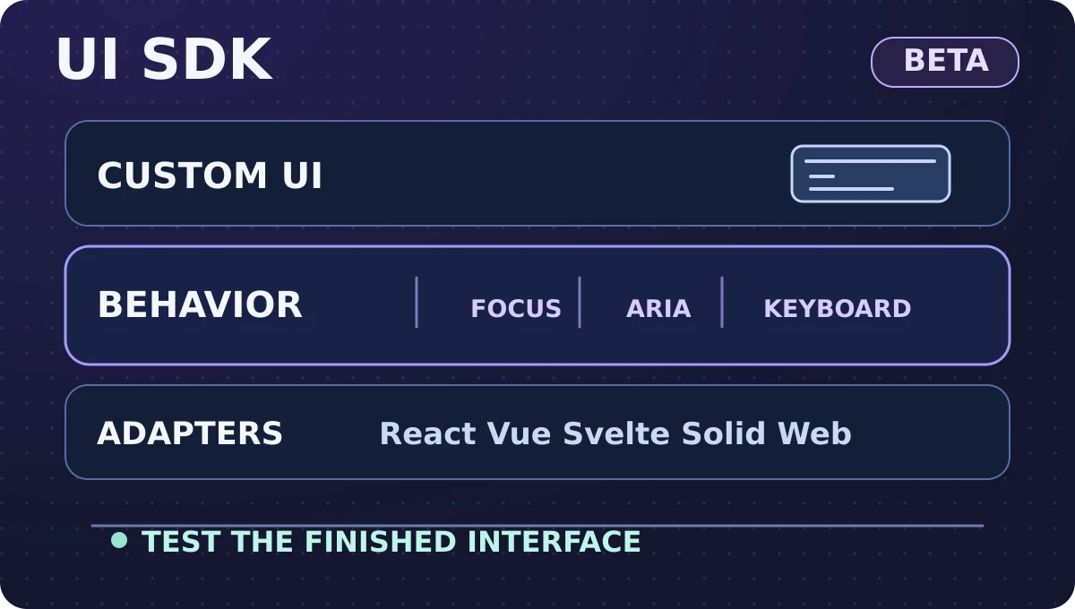
Original illustration created for Karim Elganainy’s website, based on the UI SDK project documentation. These are conceptual layers, not an official architecture diagram or accessibility certification.
Start with one nonmedical campaign tool
Imagine a stationery retailer preparing a campaign worksheet that models return on ad spend. Visitors enter planned media spend and estimated campaign-attributed revenue in the same currency, then compare low, base, and high scenarios. In the illustration, SAR 20,000 in spend and SAR 60,000 in assumed attributed revenue give 3.0× modeled ROAS, before any discussion of gross margin, fulfillment, taxes, or incrementality. If the user changes the currency label, the worksheet should not silently convert data or imply an exchange rate. No accounts, real customer records, or external advertising connections are necessary to test this idea.
The likely baseline for a small scenario set is three native radio choices, not an elaborate picker. Once comparison grows to many saved scenarios, search and an anchored panel might help. Test that one decision first, with all other fields, calculation logic and result layout unchanged. Document what the interface should do when someone opens the chooser with the keyboard, moves through candidates, commits a choice, or closes without changing the saved scenario. Choosing a scenario changes assumptions; it should not launch a campaign, write data to an advertising account, or replace the calculator's own validation. The trial should have a written edge: do not change where results are stored, add trackers, or collect contact details to make a prototype look complete. If the chooser requires any of those changes, treat them as separate decisions and keep them out of the comparison.
Specify the keyboard and recovery paths
Write an expected behavior for each step with one observable result. From the preceding field, Tab reaches the scenario trigger and focus is visible. An activation key opens the chooser according to the chosen control pattern. Where the pattern supports it, the arrow keys move the current item and typing locates an option. The screen reader exposes the control's name, state and selected value appropriately. Committing a choice updates the worksheet and preserves the intended focus destination. Escape dismisses an open chooser without changing the value and returns focus to its trigger when that trigger still exists.
Then exercise the cases a polished demo usually skips. If a scenario is deleted while its picker is open, confirm focus reaches a stable nearby control rather than falling to the page body. If the search has no matching entries, the visitor needs an intelligible empty state and an obvious way out. If there is a malformed input, the message should identify the affected field and preserve the rest of the user's work. Test a person who closes the picker, changes their mind, and opens it again. Focus and value are independent states; retaining one does not tell you what should happen to the other.
Verify locale and device, not only layout
Repeat the same task on Arabic right-to-left and English left-to-right pages. The translated label should remain intelligible, the trigger should remain within the viewport, and mixed currency, decimal and Latin text should stay associated with the correct field. Do not merely reverse every arrow key. In a vertical list, upward and downward movement still follows the list; an explicitly horizontal control needs a direction policy suited to its pattern. Test what happens when an Arabic label wraps or when numeric input includes a different decimal convention. Layout and parsing can disagree even when the component's interactions are valid.
On a narrow phone, bring up the on-screen keyboard and check the chooser near the bottom of the viewport, where there is less available space. A correctly positioned popup must still be readable and dismissible when text is enlarged, when the page scrolls, or after a device rotation. Use a mobile screen reader to hear whether the current selection and updated result are distinguishable without forcing focus away from an active field. Desktop keyboard and mobile assistive-technology checks are complementary, not alternatives. Reuse of interaction code and ARIA metadata is not an accessibility certification, and it does not verify visual contrast, copy, or the final page composition.
Measure what the behavior library changes
Compare the native or current production-style baseline with the beta prototype against the same list of tasks and devices. Record engineering hours from the first implementation through review and fixes, not just time until the first demo. Separately count whether visitors can select and cancel, whether keyboard focus returns, and how many defects remain after review. Report denominators and scope: six successful keyboard attempts out of eight observed attempts in a small prototype test is a finding about those attempts, not a claim about all customers. Critical blockers, such as getting stuck without a keyboard exit, warrant a fix even if an average looks favorable.
Guard the method against misleading shortcuts. If a developer tests only the prototype but a researcher tests the baseline with unfamiliar participants, the time figures do not answer the same question. If both use an identical phrase for tasks, swap the test order to reduce practice effects. If an interaction event is missing, distinguish missing instrumentation from a user abandoning the task. Separate a task completion event from downstream commercial actions. A functioning chooser might reduce friction. It cannot establish incremental revenue, and a higher modeled ROAS after selecting the optimistic scenario represents changed assumptions, not improved campaign performance.
Make the release decision reversible
Set clear stop conditions before beginning: keep the current interaction if the new control makes focus less reliable, cannot be serviced by the team, or introduces more complexity than the test scenario warrants. A pilot pass means the team can decide whether to proceed to a wider internal test, not that it should replace all forms. Retest after a dependency or design-system change and make handoff ownership explicit. Where accessibility requirements are binding for the organization, keep those review and sign-off processes in place and do not substitute approval by an agent for review by the responsible team.
The most useful instruction for a coding agent is not “make this interactive.” It is “make this choice reachable by keyboard and touch, preserve the committed value on cancel, return focus predictably, and show evidence on Arabic and English layouts.” That contract works even if the experiment concludes that native controls are sufficient. Vercel Labs UI SDK changes the implementation options the team can evaluate. The team still owns the workflow, the customer promise, and the evidence it needs before release.
Comments
No published comments yet.