Published November 7, 2026. Source announcement: November 5, 2026.
The announcement makes building easier, not deciding
Unbounce announced a new AI-powered landing-page builder on November 5. The company says it is built on a dataset of 2.5 billion conversions, offers prompt, template, or blank-page starting points, and adds AI credits for existing customers without increasing their current plan price. These are vendor statements, not evidence of a guaranteed conversion improvement.
The strategic question sits downstream of production: what should the page persuade a particular visitor to do, and why should that visitor believe it? A polished draft cannot answer those questions on the business’s behalf. If the offer is unclear or the evidence weak, faster building can make an unresolved proposition look finished before it has been examined.
My recommendation is to approach the release as an opportunity to shorten the distance between a hypothesis and a properly reviewed test. Do not make the number of pages produced the success metric. Make the quality of the decision that follows each page the measure of whether the new workflow is useful.
A large dataset is not your business case
A dataset can be relevant to how a tool is developed without establishing what will happen for a particular advertiser. Your audience, offer, traffic quality, fulfilment constraints, and definition of success still shape the outcome. A headline about the scale of training material should not become an assumed percentage improvement in a budget presentation.
Separate three propositions: the tool may help produce a draft; the draft may be suitable for your campaign; and the campaign may generate profitable demand. Each requires different evidence. A faster first draft can be valuable even if conversion performance is unchanged. Conversely, an attractive page can produce more submissions while making the sales team’s job harder.
Before adoption, write a small business case with explicit costs and benefits. Include review time, implementation effort, tracking checks, and maintenance, not only generation speed. State which benefits are already observed and which remain hypotheses. This prevents a procurement decision from borrowing confidence from a performance result that the team has not actually measured.
Write a decision brief before writing a prompt
A useful page brief names one audience, one immediate problem, one offer, and one next step. It also states why the visitor should act now, what evidence supports the promise, and what the page must not imply. This is a decision document. A long list of desired colours and sections is not an adequate substitute.
Start with the visitor’s uncertainty rather than the company’s preferred description. Someone considering an equipment maintenance contract may need to understand service coverage, response conditions, and eligibility before reading a broad statement about excellence. The page should answer the uncertainty that blocks action, not merely reproduce the order of an internal sales presentation.
For a hypothetical Riyadh industrial-services company, the brief might target facility managers seeking an inspection quotation. The intended action is a request for an eligibility check, not an implied promise of immediate emergency service. This distinction should shape the headline, form, and confirmation message. The example illustrates planning; it is not a reported customer case.
Build an evidence sequence, not a decorative scroll
Every section should earn its place by answering a question that matters to the decision. An opening establishes relevance. A clear explanation defines the offer. Evidence supports important claims. Conditions remove ambiguity. A call to action tells the visitor what happens next. This sequence is a useful hypothesis, not a universal layout that every business should copy.
Challenge each proposed element with a simple question: what uncertainty does this remove? A testimonial without context may add decoration without establishing relevant experience. A large feature list may increase reading effort while leaving the key eligibility condition unanswered. Remove elements that have no decision-making role, even when they make the page appear more elaborate.
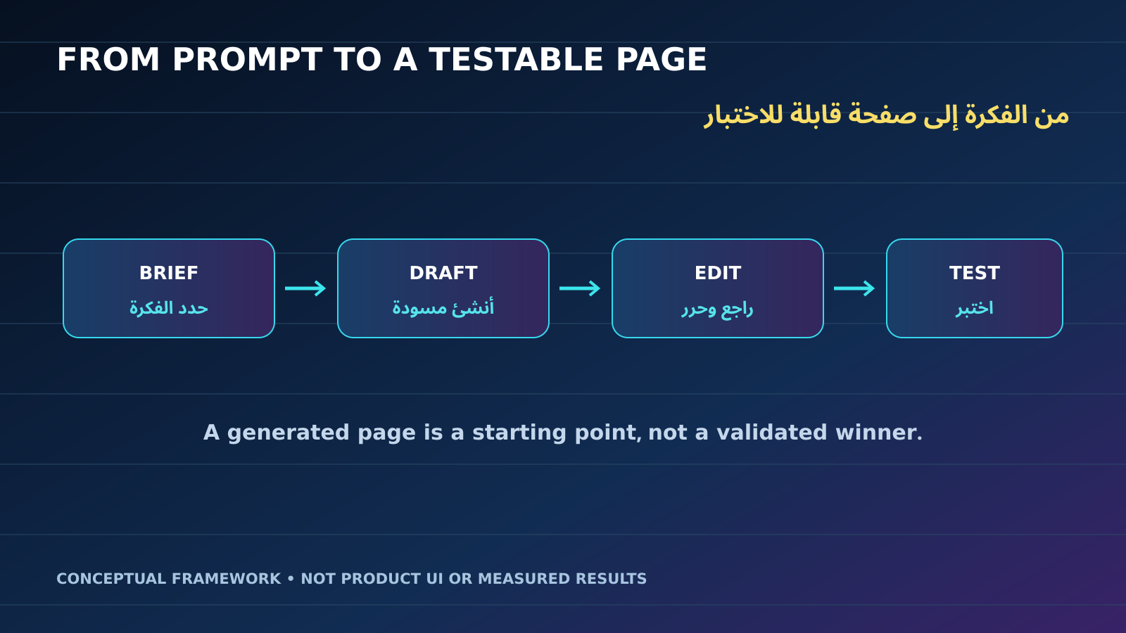
Original conceptual illustration created for this article: a decision path from visitor uncertainty to fulfilled outcome. It is not an Unbounce interface or an official product diagram.
Review the sequence with someone unfamiliar with the project. Ask what they believe is being offered before explaining what you intended.
Define conversion beyond the form submission
A submission is an event, not automatically a successful business outcome. Teams should distinguish an initial expression of interest from a valid contact, an eligible prospect, a completed booking, and a fulfilled sale. These stages expose where a page creates useful demand and where its apparent performance depends on passing work or confusion to somebody else.
Consider a hypothetical numerical example, not a benchmark or experimental finding. Two campaigns each spend AED 600. One produces 30 submissions and six bookings; the other produces 24 submissions and eight bookings. Their submission costs are AED 20 and AED 25, while their booking costs are AED 100 and AED 75. Choosing only by submission cost would favour a different campaign.
Those small counts do not establish statistical reliability or explain causation. They illustrate why the denominator matters. Agree on qualification rules and connect the page’s events to downstream records before declaring a winner. Review missing or duplicate records too, because a clean-looking dashboard can still be measuring an incomplete customer journey.
Change one meaningful thing at a time
A page test needs a question that the result can answer. Comparing two complete redesigns can identify a better package under the observed conditions, but it cannot reveal whether the headline, offer, proof, or form caused the difference. Decide whether you want to choose a package or learn about a mechanism before designing the test.
A useful first comparison might change how the offer is explained while holding the form, destination, audience, and commercial terms steady. Another might test whether an earlier eligibility explanation reduces unsuitable enquiries. Neither requires a large library of unrelated page versions. The discipline lies in making the contrast interpretable and the outcome relevant.
Set the evaluation plan before launch. Specify the outcome, guardrails, minimum evidence needed, and conditions that would invalidate the comparison. Avoid repeatedly changing the page during the measurement period and then treating the results as one stable experiment. If urgent corrections are necessary, record them and reconsider whether the original test question remains answerable.
Treat mobile and bilingual review as separate checks
A page can look convincing in an editor and still ask too much of a visitor on a small screen. Review the actual journey from an ad click through loading, reading, entering information, submitting, and receiving confirmation. Look for avoidable interruptions and ambiguity, not simply whether the desktop design has become narrower without breaking.
For bilingual GCC campaigns, check that each language communicates the same commercial conditions even when the wording and order differ. A literal translation may not be the clearest explanation. Ensure that prices, dates, eligibility, and the next step remain consistent. Arabic layout deserves its own inspection, including direction, field labels, line breaks, and the visibility of essential qualifications.
Use realistic tasks during review. Ask a colleague to identify the total commitment, explain who the offer is for, and complete the form without assistance. Observe where they hesitate rather than explaining the page as they go. A brief task-based review can reveal a decision problem that a long conversation about colours would miss.
The page ends where the operation begins
A conversion promise includes what happens after the click. If the page invites a quotation request, someone must receive the information, understand the context, and respond through a suitable process. A better-looking page cannot repair a lead-routing system that loses requests or sends the sales team incomplete information about what the visitor expected.
Write the post-submission journey alongside the page brief. Define the confirmation message, destination of the request, owner, qualification step, and escalation path. Avoid promising a response time that the operation has not approved. Where several teams share responsibility, name the handoff rather than assuming that the form integration itself completes the commercial task.
For a hypothetical Abu Dhabi maintenance business, a useful request might include the service location and a broad description of the issue. Asking for unnecessary detail can create friction; asking for too little can create an unusable enquiry. The right balance depends on the actual fulfilment process, so involve the receiving team before finalising the form.
Control page sprawl before it becomes maintenance debt
When production becomes easier, it is tempting to create a page for every audience label or campaign variation. Each additional page also creates another place where prices, conditions, tracking, and contact details can become outdated. The relevant question is whether a new page serves a distinct decision need, not whether it is inexpensive to generate.
Maintain a page register with an owner, purpose, offer version, traffic source, review date, and retirement condition. Reuse a page when the commercial proposition and visitor need are genuinely the same. Create a separate version when the decision context materially changes. This keeps segmentation purposeful rather than turning minor naming differences into permanent maintenance obligations.
Plan reversibility. Save the approved baseline, document the changes, and define who can restore the previous version if something breaks. Archive experiments that are no longer receiving traffic instead of leaving them available indefinitely without ownership. A landing-page programme should accumulate knowledge, not an inventory of forgotten pages that nobody can confidently approve.
Use the first month to build a repeatable operating habit
A sensible first-month plan has four phases rather than a promise of an instant uplift. First, define the audience, offer, and downstream outcome. Next, prepare and review one candidate page. Then verify the journey and measurement before sending meaningful traffic. Finally, evaluate what the evidence supports and decide what should happen next.
The calendar is a planning aid, not a statistical stopping rule. A low-volume campaign may need longer to gather useful evidence, while an obvious technical fault should be corrected immediately. Separate those situations. Do not continue a broken experience merely to preserve a test, and do not declare a winner merely because a reporting deadline arrived.
The practical takeaway is to use easier building to make experimentation more disciplined. A useful page programme connects a clear promise to relevant evidence, a measurable action, and a fulfilment process that can keep the promise. If the team can explain that chain, it has a stronger basis for growth than a collection of impressive first drafts.
Primary source: Unbounce’s company-issued announcement, November 5, 2026.
Comments
No published comments yet.