
Open a product page on a phone and look at the first few reviews. What would a shopper conclude before scrolling further? Now compare that impression with the complete rating distribution. The exercise gives a marketing team a concrete question to investigate: does the interface make the available evidence understandable?
Treat review presentation as part of the customer journey. Design, marketing, customer service and moderation should agree how feedback is collected, displayed and explained. The workflow below is an original editorial proposal, not an intervention validated by the research.
What the research establishes
In four experiments, grouping minority reviews together during sequential viewing increased their perceived prevalence and shifted product evaluations. The pattern appeared for positive and negative minorities, was stronger on mobile, and weakened under cognitive load. Kim, Nelson and Attari, Psychology & Marketing, first published October 30, 2026.
This article uses the public abstract only. Sample sizes, effect magnitudes and sales outcomes have not been verified here. The practical recommendations that follow are hypotheses for local testing.
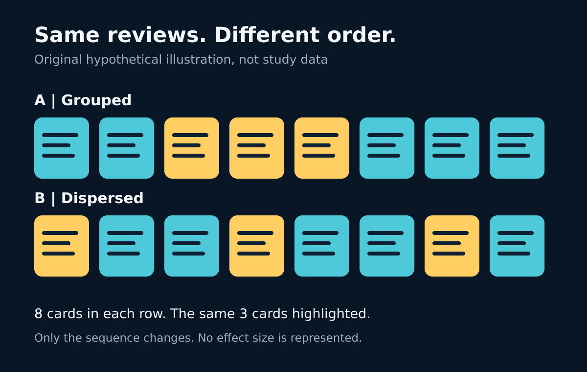
Original explanatory illustration. Each row contains eight cards; the same three highlighted cards are grouped (A) or dispersed (B). The figures are invented to explain sequence, not study stimuli, measured effects or the separate retailer example below. Concept prompted by the study.
Start with the complete picture
Inventory each review surface: the product page, search results, campaign landing pages and any rotating testimonial component. Record the default ordering, reviews visible initially, available filters and moderation policy. Check the actual mobile experience, including keyboard and screen-reader use.
For each surface, ask whether someone can find the total review count and distribution across ratings. Label the scope: one product variant, a product family, a location or the whole business. Combining feedback from several contexts needs a clear explanation.
Display the date range and define any verification badge. If only eligible published reviews are included, explain the eligibility policy. A review count should not imply that it represents every purchaser or every experience.
Make sorting and filtering understandable
Offer useful controls such as newest first, rating and verified purchase, where the underlying data supports them. Identify the active setting and provide an obvious reset. When a filter reduces the list, show both the matching count and the overall count.
If the default is “most relevant,” explain its practical meaning. Relevance could depend on a selected product version or a customer-chosen topic. Record the actual rule rather than presenting a vague label that conceals commercially favorable selection.
Avoid promising a perfectly neutral order. Newest first, for example, answers a recency question but may emphasize an unusual launch period. Choose a defensible default, preserve alternatives and make limitations visible. Apply moderation consistently to praise and criticism.
A fictional retailer example
Consider an invented retailer selling one desk lamp. Its 100 published reviews comprise 60 five-star, 20 four-star, 10 three-star, six two-star and four one-star ratings. All figures and circumstances here are hypothetical.
Suppose its opening carousel contains the four one-star reviews because an editor grouped comments about a switch problem. The product team should investigate that issue. The interface should also explain the selection and preserve access to the complete distribution.
A proposed redesign places the distribution above the list, labels a “switch” topic filter and states “4 matching reviews out of 100 published reviews” if those are the exact matching records. A visible control returns to all reviews. Do not invent topic matches to fit the example.
The team can then ask test users to describe the feedback, locate the reported problem and identify how many reviews they are viewing. This checks comprehension without claiming that a particular layout will increase purchases.
Measure understanding before declaring success
Define the test question before changing the page: can shoppers accurately interpret the review evidence and find relevant concerns? Select one primary comprehension measure, such as correctly distinguishing the filtered count from the total. Fix the scoring rule in advance.
If running an A/B test, keep eligibility, review availability, prices and offers consistent across variants. Randomize assignment where feasible, document the exposure rule and plan the sample requirement with an analyst. Watch for tracking failures and unequal group allocation. Do not repeatedly stop when a favorable result appears.
Track purchasing and post-purchase outcomes as secondary measures where available. Include returns, review-related complaints and support questions about misunderstood product limitations. Allow enough follow-up for these outcomes to mature. A click increase alone should not determine rollout.
The site's guide to SMART marketing objectives provides related planning context. Set an owner, review date and measurable decision rule for this project.
Put service safeguards in writing
For a service business, distinguish feedback about booking, communication and facilities from claims about the underlying service result. Healthcare teams should be especially careful: patient testimonials cannot establish clinical effectiveness or suitability for another person.
Use only feedback authorized for the intended publication. Review privacy, consent and platform requirements before reusing it, and do not expose identifiable health details in a test or advertising tool. Invite the relevant clinical, privacy and compliance reviewers to assess actual healthcare implementation.
Assign an owner who can pause a misleading display, restore the previous version and investigate. Keep a record of ordering changes and moderation decisions. Commercial pressure should not quietly rewrite the rules for which criticism remains visible.
Karim’s takeaway
Give customers a useful view of the evidence, then measure whether they understand it. Start with a review-interface audit before commissioning another testimonial campaign. A worthwhile improvement leaves criticism discoverable, explains selection and makes the next product or service decision clearer. The cover is an original conceptual illustration, not a platform screenshot or an empirical chart.
Comments
No published comments yet.